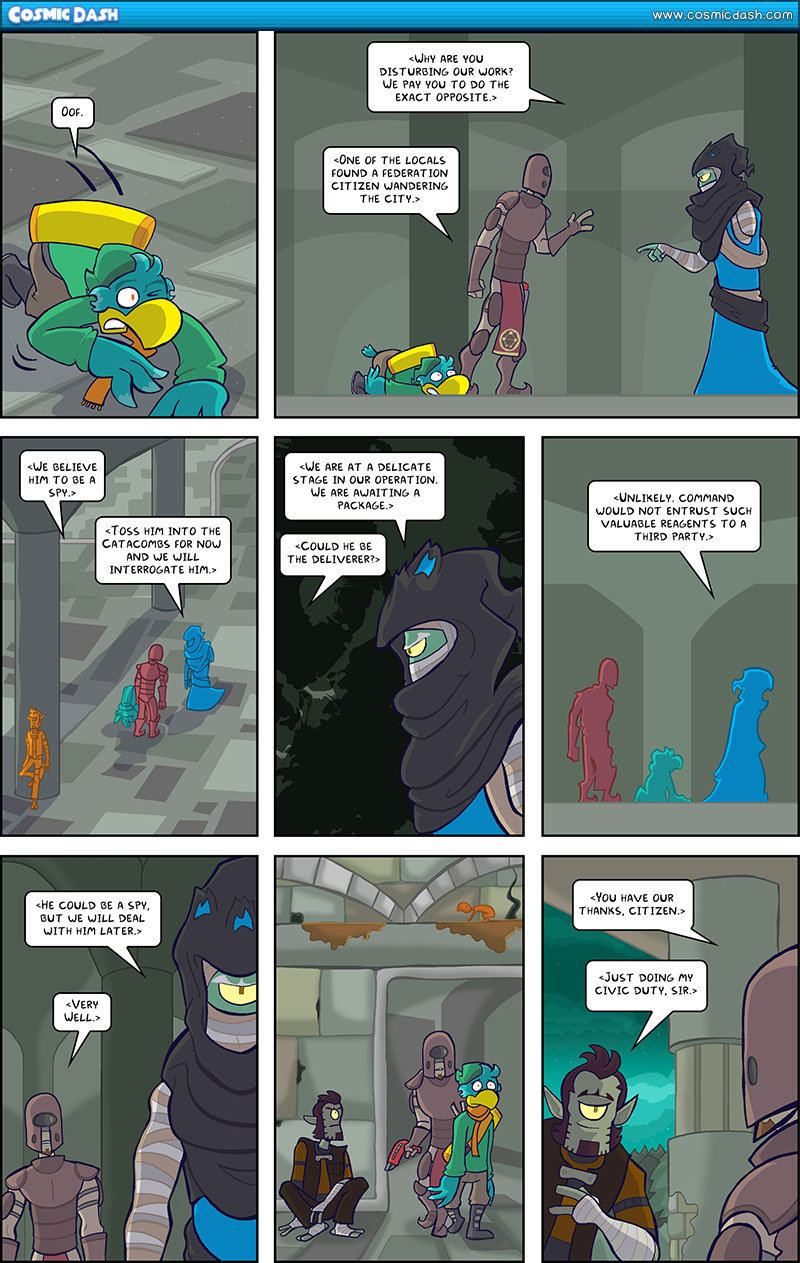
Let’s talk stylistic choices here. There are two aspects of this page I want to point out.
First of all, like all my pages, this one features dark blue/purple lineart around the characters. I have no reason as to why I chose to do that, other than it has become a kind of signature of my work. I have no real idea when I started doing this, but it just seems to work.
The other thing I wish to point out in the characters being mono-color in panels 3 and 5. I learned early on when I was doing the comic that coloring the characters normally when they’re at a huge distance away just makes them muddled and difficult to see. I realized that if the characters had a strong enough shape, I could just fill them with a base color and they’d be fine. Originally though, my distance color was kind of a blueish grey, and after a while I realized that the characters blended into the background every once in a while.
Starting with the previous episode, I color-coded Dash, Mara, and T-Wk, and lo and behold, it actually worked! I’ve kind of continued that technique here, particularly in panel 3. Panel 5 is different because I am strictly using character silhouettes, but I think it works there. What do you think?
Also, I guess there is a third thing. I just realized that this page has a lot of textural things going for it. I never really noticed that.


